Viewing Distance Tutorial

Learn how to identify the size your design needs to be for ideal legibility at a given distance. Don't make your design too small if you intend to have people read your sign for a certain distance away.

Knowing the ideal viewing distance of your intended print is essential to ensuring your design looks great on the final product. You always want to make sure any text you use is the best size for readability, especially if it contains important information like points of contact, safety warnings, and so on.
The best way to size your product is to cut a piece of paper in the approximate size you think you'll want and tape it to your application surface to see the outcome. If your first attempt is too small or too large, you can always re-size it and repeat the process. Take it one step further and use a marker to write up what you think you'll design. Once you feel like you've got it exactly the right size, use those dimensions to order your product.
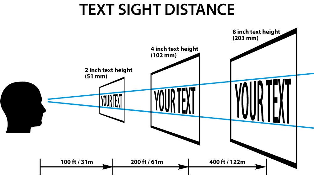
Picking the right size of text is going to be based on the font, colors, and ideal viewing distance. If you plan on having people view your design from about 25 feet away, you will need your lettering to be at least 1 inch letters in a sans-serif font, like Arial, and use high contrasting colors like black text on a white background. As an example, take a look at this graphic. You'll notice that the further away the design is from the viewer, the larger the lettering needs to be in order for the message to be readable.

Fonts and Readability
There are a lot of factors involved in choosing the right font for your design like style, context, tone, and more. Readability is key to making sure people can read your message, so you want to make sure the fonts you choose are legible at the expected viewing distance. Thin or decorative lettering might look fantastic in a design seen up close, like a printed invitation or a notecard, but it won't be quite as readable at the same height from further away.
For example, think of a letter chart you might see during an eye exam. The larger sized letters at the top of the chart are usually much easier to read at a distance than the smaller letters at the bottom of the chart, even though they're printed in the same font style. Larger sized bolder, block style lettering is far easier to read at a distance than thinner script style lettering.
Another thing to consider is how or where your intended audience will be located when reading your message. If your design is intended for a storefront where people may be slowly walking past, decorative or thin stroke fonts will be easy to read. If you use the same design on a bilboard or a yard sign where someone will be driving past quickly, your message would be far less legible and look blury.
